“An eye-catching brand identity for an international supplier of chimney rods”
We created this eye-catching logo for Rodstation to ensure that they stand out in their specialist field.
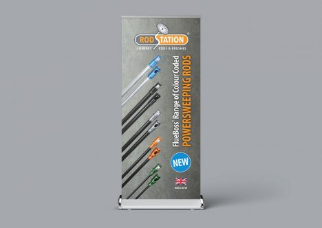
Using the contrasting orange and grey brand colours we designed a cohesive visual identity to be applied across all of their company platforms.
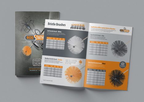
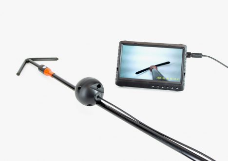
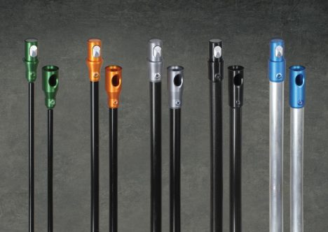
From the website and product photography to printed literature and advertising, we have helped Rodstation achieve a professional and striking brand.

 Brand Identity