“Refreshing the brand identity of an award-winning Engineering company”
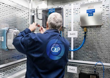
The CP Group brand identity
The CP Group rebrand showcases the company’s growth and innovation within the engineering sector. We had the privilege of reimagining this identity, ensuring that they remain at the forefront of their sector.
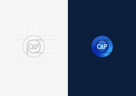
We replaced the dated design with a minimal and contemporary logo-mark. Aligning their aesthetic with their ever-evolving positions.
The newly designed logo-mark serves as the main symbol of the brand identity. It represents the company’s structure and values, with different sections symbolising the companies core branches. Each branch plays an integral role in the company’s combined success. We wanted to make sure the identity reflects this unity.
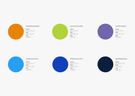
Alongside the logo, we also carried out a revamp of the overall branding. We developed a colour palette of blue and orange to create a simple yet bold visual identity, carefully choosing these colours to convey professionalism and energy—traits synonymous with C&P Group.
This was expanded by introducing a secondary colour palette. Giving each subsidiary company its own distinct identity colour within the broader CP Group branding. This approach ensures that the subsidiaries are part of a cohesive brand while still standing out individually in their respective markets.
To see this refreshed brand identity in action, visit their custom-built, content-managed website here: www.cpengineering.co.uk. The website offers an engaging and user-friendly experience, serving as a digital extension of the CP Group brand identity.





 Brand Identity